1. 신용카드 부정사용자 검출
1.1 신용카드 부정사용자 검출
- 신용카드 사기 검출 분류 실습용 데이터
- 데이터에 class라는 이름의 컬럼이 사기 유무를 의미
- class 컬럼의 불균형이 극심해서 전체 데이터의 약 0.172%가 사기(Fraud)를 가짐
- 금융 데이터이고, 기업의 기밀 보호를 위해 대다수의 특성이름은 삭제되어있음
- Amount : 거래금액
- Class : 사기 여부(1이면 Fraud)
1.2 데이터 로드
1
2
3
import pandas as pd
raw_data = pd.read_csv('https://media.githubusercontent.com/media/hmkim312/datas/main/creditcard/creditcard.csv')
raw_data.head()
| Time | V1 | V2 | V3 | V4 | V5 | V6 | V7 | V8 | V9 | ... | V21 | V22 | V23 | V24 | V25 | V26 | V27 | V28 | Amount | Class | |
|---|---|---|---|---|---|---|---|---|---|---|---|---|---|---|---|---|---|---|---|---|---|
| 0 | 0.0 | -1.359807 | -0.072781 | 2.536347 | 1.378155 | -0.338321 | 0.462388 | 0.239599 | 0.098698 | 0.363787 | ... | -0.018307 | 0.277838 | -0.110474 | 0.066928 | 0.128539 | -0.189115 | 0.133558 | -0.021053 | 149.62 | 0 |
| 1 | 0.0 | 1.191857 | 0.266151 | 0.166480 | 0.448154 | 0.060018 | -0.082361 | -0.078803 | 0.085102 | -0.255425 | ... | -0.225775 | -0.638672 | 0.101288 | -0.339846 | 0.167170 | 0.125895 | -0.008983 | 0.014724 | 2.69 | 0 |
| 2 | 1.0 | -1.358354 | -1.340163 | 1.773209 | 0.379780 | -0.503198 | 1.800499 | 0.791461 | 0.247676 | -1.514654 | ... | 0.247998 | 0.771679 | 0.909412 | -0.689281 | -0.327642 | -0.139097 | -0.055353 | -0.059752 | 378.66 | 0 |
| 3 | 1.0 | -0.966272 | -0.185226 | 1.792993 | -0.863291 | -0.010309 | 1.247203 | 0.237609 | 0.377436 | -1.387024 | ... | -0.108300 | 0.005274 | -0.190321 | -1.175575 | 0.647376 | -0.221929 | 0.062723 | 0.061458 | 123.50 | 0 |
| 4 | 2.0 | -1.158233 | 0.877737 | 1.548718 | 0.403034 | -0.407193 | 0.095921 | 0.592941 | -0.270533 | 0.817739 | ... | -0.009431 | 0.798278 | -0.137458 | 0.141267 | -0.206010 | 0.502292 | 0.219422 | 0.215153 | 69.99 | 0 |
5 rows × 31 columns
1.3 특성확인
1
raw_data.columns
1
2
3
4
5
Index(['Time', 'V1', 'V2', 'V3', 'V4', 'V5', 'V6', 'V7', 'V8', 'V9', 'V10',
       'V11', 'V12', 'V13', 'V14', 'V15', 'V16', 'V17', 'V18', 'V19', 'V20',
       'V21', 'V22', 'V23', 'V24', 'V25', 'V26', 'V27', 'V28', 'Amount',
       'Class'],
      dtype='object')
- 데이터의 특성은 여러가지의 이유로 감추어져 있어서 V1, V2 이런식임
1.4 데이터 라벨의 불균형 확인
1
raw_data['Class'].value_counts()
1
2
3
0    284315
1       492
Name: Class, dtype: int64
1
2
fraud_rate = round(raw_data['Class'].value_counts()[1] / len(raw_data) * 100, 2)
print(f'Frauds {fraud_rate}% of the dataset')
1
Frauds 0.17% of the dataset
- 실제로 부정사용자는 전체 데이터의 0.17% 밖에 안됨
- 그렇기 때문에 정확히 잘 잡는게 중요함
1.5 그래프로도 안보임
1
2
3
4
5
6
import seaborn as sns
import matplotlib.pyplot as plt

sns.countplot('Class', data=raw_data)
plt.title('Class Distributions \n (0 : No Fraud || 1 : Fraud)', fontsize = 14)
plt.show()
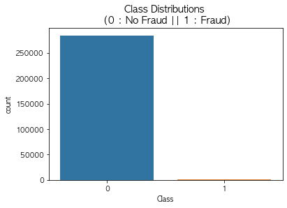
- title을 적을때 \n하면 줄바꿈이 됨
1.6 X, y 로 데이터 나누기
1
2
3
4
5
6
7
from sklearn.model_selection import train_test_split

X = raw_data.iloc[:, 1:-1]
y = raw_data.iloc[:, -1]

X_train, X_test, y_train, y_test = train_test_split(
    X, y, test_size=0.3, random_state=13, stratify=y)
- stratify : Data의 비율을 유지시킴
- 만약 Y가 Data가 25%의 0과 75%의 1로 이루어진 Binary Set일 때, stratify=Y로 설정하면 나누어진 데이터셋들도 0과 1을 각각 25%, 75%로 유지한 채 분할됨
1.7 불균형 정도 확인
1
2
3
import numpy as np

np.unique(y_train, return_counts=True)
1
(array([0, 1]), array([199020,    344]))
- np.unique에서 retunr_counts를 하면 각 갯수를 보여줌
1
2
tmp = np.unique(y_train, return_counts=True)[1]
tmp[1] / len(y_train) * 100
1
0.17254870488152324
- train 데이터에서의 불균형도 엄청남
1
np.unique(y_test, return_counts= True)
1
(array([0, 1]), array([85295,   148]))
1
2
tmp = np.unique(y_test, return_counts=True)[1]
tmp[1] / len(y_test) * 100
1
0.17321489179921118
- test 데이터에서의 불균형
2. 첫번째 스탭
2.1 분류기의 성능을 측정하는 함수 작성
1
2
3
4
5
6
7
8
9
10
from sklearn.metrics import (accuracy_score, precision_score, recall_score, f1_score, roc_auc_score)

def get_clf_eval(y_test, pred):
    acc = accuracy_score(y_test, pred)
    pre = precision_score(y_test, pred)
    re = recall_score(y_test, pred)
    f1 = f1_score(y_test, pred)
    auc = roc_auc_score(y_test, pred)

    return acc, pre, re, f1, auc
- 각 분류기들의 accuracy, precision, recall, f1, roc를 볼수 있는 함수 작성
2.2 성능을 출력하는 함수 작성
1
2
3
4
5
6
7
8
9
10
11
from sklearn.metrics import confusion_matrix

def print_clf_eval(y_test, pred):
    confusion = confusion_matrix(y_test, pred)
    acc, pre ,re, f1, auc = get_clf_eval(y_test, pred)

    print('==> confusion matrix')
    print(confusion)
    print('=========')
    print('Accuracy : {0:4f}, Precision : {1:4f}'.format(acc, pre))
    print('Recall : {0:4f}, F1 : {1:4f}, AUC : {2:4f}'.format(re, f1, auc))
- 모델별로 위에서 생성한 score를 출력하는 함수 작성
2.3 Logistic Regression
1
2
3
4
5
6
7
from sklearn.linear_model import LogisticRegression

lr_clf = LogisticRegression(random_state=13, solver='liblinear')
lr_clf.fit(X_train, y_train)
lr_pred = lr_clf.predict(X_test)

print_clf_eval(y_test, lr_pred)
1
2
3
4
5
6
==> confusion matrix
[[85284    11]
 [   60    88]]
=========
Accuracy : 0.999169, Precision : 0.888889
Recall : 0.594595, F1 : 0.712551, AUC : 0.797233
- accuracy가 0.99??
2.4 Decision Tree
1
2
3
4
5
6
7
from sklearn.tree import DecisionTreeClassifier

dt_clf = DecisionTreeClassifier(random_state= 13, max_depth= 4)
dt_clf.fit(X_train, y_train)
dt_pred = dt_clf.predict(X_test)

print_clf_eval(y_test, dt_pred)
1
2
3
4
5
6
==> confusion matrix
[[85281    14]
 [   42   106]]
=========
Accuracy : 0.999345, Precision : 0.883333
Recall : 0.716216, F1 : 0.791045, AUC : 0.858026
- 이것도 accuracy가 0.99?
2.5 Random Forest
1
2
3
4
5
6
from sklearn.ensemble import RandomForestClassifier
rf_clf = RandomForestClassifier(random_state=13, n_jobs=-1, n_estimators=100)
rf_clf.fit(X_train, y_train)
rf_pred = rf_clf.predict(X_test)

print_clf_eval(y_test, rf_pred)
1
2
3
4
5
6
==> confusion matrix
[[85290     5]
 [   38   110]]
=========
Accuracy : 0.999497, Precision : 0.956522
Recall : 0.743243, F1 : 0.836502, AUC : 0.871592
- 마찬가지로 성능이 좋아보인다
2.6 LightGBM
1
2
3
4
5
6
7
8
from lightgbm import LGBMClassifier

lgbm_clf = LGBMClassifier(n_estimators=1000, num_leaves=64, n_jobs=-1, boost_from_average = False)

lgbm_clf.fit(X_train, y_train)
lgbm_pred = lgbm_clf.predict(X_test)

print_clf_eval(y_test, lgbm_pred)
1
2
3
4
5
6
==> confusion matrix
[[85289     6]
 [   34   114]]
=========
Accuracy : 0.999532, Precision : 0.950000
Recall : 0.770270, F1 : 0.850746, AUC : 0.885100
- 이것도 0.99가 나온다.
3. 전체 모델을 한번에 볼수있게 하기
3.1 모델과 데이터를 주면 성능을 출력하는 함수 작성
1
2
3
4
5
def get_result(model, X_train, y_train, X_test, y_test):
    model.fit(X_train, y_train)
    pred = model.predict(X_test)

    return get_clf_eval(y_test, pred)
3.2 다수의 모델의 성능을 정리해서 DataFrame으로 반환하는 함수 작성
1
2
3
4
5
6
7
8
9
def get_result_pd(models, model_names, X_train, y_train, X_test, y_test):
    col_names = ['accuracy', 'precision', 'recall', 'f1', 'roc_acu']

    tmp = []

    for model in models:
        tmp.append(get_result(model, X_train, y_train, X_test, y_test))

    return pd.DataFrame(tmp, columns=col_names, index = model_names)
3.3 4개의 분류 모델을 한번에 표로 정리하기
1
2
3
4
5
6
7
8
9
10
11
12
import time

models = [lr_clf, dt_clf, rf_clf, lgbm_clf]

model_names = ['LinearReg', 'DecisionTree', 'RandomForest', 'LightGBM']

start_time = time.time()

results = get_result_pd(models, model_names, X_train, y_train, X_test, y_test)

print('Fit time : ', time.time() - start_time)
results
1
Fit time :  26.41209316253662
| accuracy | precision | recall | f1 | roc_acu | |
|---|---|---|---|---|---|
| LinearReg | 0.999169 | 0.888889 | 0.594595 | 0.712551 | 0.797233 |
| DecisionTree | 0.999345 | 0.883333 | 0.716216 | 0.791045 | 0.858026 |
| RandomForest | 0.999497 | 0.956522 | 0.743243 | 0.836502 | 0.871592 |
| LightGBM | 0.999532 | 0.950000 | 0.770270 | 0.850746 | 0.885100 |
- 앙상블 계열의 성능이 우수함을 알수 있음
4. 데이터를 정리해서 다시 도전해보기
4.1 raw_data의 Amount 컬럼 확인
1
2
3
plt.figure(figsize=(10, 5))
sns.distplot(raw_data['Amount'], color='r')
plt.show()
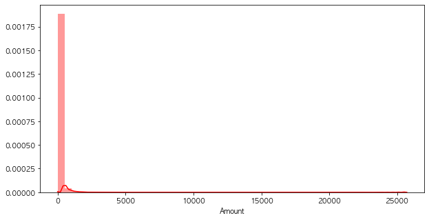
- 특정 구간의 분포가 많음
4.2 Amount 컬럼에 StandardScaler 적용
1
2
3
4
5
6
7
8
from sklearn.preprocessing import StandardScaler

scaler = StandardScaler()
amount_n = scaler.fit_transform(raw_data['Amount'].values.reshape(-1, 1))

raw_data_copy = raw_data.iloc[:, 1:-2]
raw_data_copy['Amount_Scaled'] = amount_n
raw_data_copy.head()
| V1 | V2 | V3 | V4 | V5 | V6 | V7 | V8 | V9 | V10 | ... | V20 | V21 | V22 | V23 | V24 | V25 | V26 | V27 | V28 | Amount_Scaled | |
|---|---|---|---|---|---|---|---|---|---|---|---|---|---|---|---|---|---|---|---|---|---|
| 0 | -1.359807 | -0.072781 | 2.536347 | 1.378155 | -0.338321 | 0.462388 | 0.239599 | 0.098698 | 0.363787 | 0.090794 | ... | 0.251412 | -0.018307 | 0.277838 | -0.110474 | 0.066928 | 0.128539 | -0.189115 | 0.133558 | -0.021053 | 0.244964 |
| 1 | 1.191857 | 0.266151 | 0.166480 | 0.448154 | 0.060018 | -0.082361 | -0.078803 | 0.085102 | -0.255425 | -0.166974 | ... | -0.069083 | -0.225775 | -0.638672 | 0.101288 | -0.339846 | 0.167170 | 0.125895 | -0.008983 | 0.014724 | -0.342475 |
| 2 | -1.358354 | -1.340163 | 1.773209 | 0.379780 | -0.503198 | 1.800499 | 0.791461 | 0.247676 | -1.514654 | 0.207643 | ... | 0.524980 | 0.247998 | 0.771679 | 0.909412 | -0.689281 | -0.327642 | -0.139097 | -0.055353 | -0.059752 | 1.160686 |
| 3 | -0.966272 | -0.185226 | 1.792993 | -0.863291 | -0.010309 | 1.247203 | 0.237609 | 0.377436 | -1.387024 | -0.054952 | ... | -0.208038 | -0.108300 | 0.005274 | -0.190321 | -1.175575 | 0.647376 | -0.221929 | 0.062723 | 0.061458 | 0.140534 |
| 4 | -1.158233 | 0.877737 | 1.548718 | 0.403034 | -0.407193 | 0.095921 | 0.592941 | -0.270533 | 0.817739 | 0.753074 | ... | 0.408542 | -0.009431 | 0.798278 | -0.137458 | 0.141267 | -0.206010 | 0.502292 | 0.219422 | 0.215153 | -0.073403 |
5 rows × 29 columns
- 일단 모든 데이터에 Scaler를 적용함
4.3 데이터 나누기
1
2
X_train, X_test, y_train, y_test = train_test_split(
    raw_data_copy, y, test_size=0.3, random_state=13, stratify=y)
4.4 모델 재 평가
1
2
3
4
5
6
7
8
9
10
11
12
import time

models = [lr_clf, dt_clf, rf_clf, lgbm_clf]

model_names = ['LinearReg', 'DecisionTree', 'RandomForest', 'LightGBM']

start_time = time.time()

results = get_result_pd(models, model_names, X_train, y_train, X_test, y_test)

print('Fit time : ', time.time() - start_time)
results
1
Fit time :  23.386101961135864
| accuracy | precision | recall | f1 | roc_acu | |
|---|---|---|---|---|---|
| LinearReg | 0.999169 | 0.888889 | 0.594595 | 0.712551 | 0.797233 |
| DecisionTree | 0.999345 | 0.883333 | 0.716216 | 0.791045 | 0.858026 |
| RandomForest | 0.999497 | 0.956522 | 0.743243 | 0.836502 | 0.871592 |
| LightGBM | 0.999520 | 0.949580 | 0.763514 | 0.846442 | 0.881722 |
4.5 모델별 ROC커브
1
2
3
4
5
6
7
8
9
10
11
12
13
14
15
16
17
18
from sklearn.metrics import roc_curve


def draw_roc_curve(models, model_names, X_test, y_test):
    plt.figure(figsize=(10, 10))

    for model in range(len(models)):
        pred = models[model].predict_proba(X_test)[:, 1]
        fpr, tpr, thresholds = roc_curve(y_test, pred)
        plt.plot(fpr, tpr, label=model_names[model])

    plt.plot([0, 1], [0, 1], 'k--', label='random quess')
    plt.title('ROC')
    plt.legend()
    plt.grid()
    plt.show()

draw_roc_curve(models, model_names, X_test, y_test)
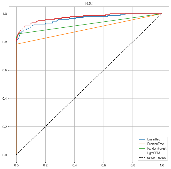
- 딱히 변화는 없어보인다.
- 스케일링을 다른것으로 해볼까?
4.6 log scale
1
2
3
4
amount_log = np.log1p(raw_data['Amount'])

raw_data_copy['Amount_Scaled'] = amount_log
raw_data_copy.head()
| V1 | V2 | V3 | V4 | V5 | V6 | V7 | V8 | V9 | V10 | ... | V20 | V21 | V22 | V23 | V24 | V25 | V26 | V27 | V28 | Amount_Scaled | |
|---|---|---|---|---|---|---|---|---|---|---|---|---|---|---|---|---|---|---|---|---|---|
| 0 | -1.359807 | -0.072781 | 2.536347 | 1.378155 | -0.338321 | 0.462388 | 0.239599 | 0.098698 | 0.363787 | 0.090794 | ... | 0.251412 | -0.018307 | 0.277838 | -0.110474 | 0.066928 | 0.128539 | -0.189115 | 0.133558 | -0.021053 | 5.014760 |
| 1 | 1.191857 | 0.266151 | 0.166480 | 0.448154 | 0.060018 | -0.082361 | -0.078803 | 0.085102 | -0.255425 | -0.166974 | ... | -0.069083 | -0.225775 | -0.638672 | 0.101288 | -0.339846 | 0.167170 | 0.125895 | -0.008983 | 0.014724 | 1.305626 |
| 2 | -1.358354 | -1.340163 | 1.773209 | 0.379780 | -0.503198 | 1.800499 | 0.791461 | 0.247676 | -1.514654 | 0.207643 | ... | 0.524980 | 0.247998 | 0.771679 | 0.909412 | -0.689281 | -0.327642 | -0.139097 | -0.055353 | -0.059752 | 5.939276 |
| 3 | -0.966272 | -0.185226 | 1.792993 | -0.863291 | -0.010309 | 1.247203 | 0.237609 | 0.377436 | -1.387024 | -0.054952 | ... | -0.208038 | -0.108300 | 0.005274 | -0.190321 | -1.175575 | 0.647376 | -0.221929 | 0.062723 | 0.061458 | 4.824306 |
| 4 | -1.158233 | 0.877737 | 1.548718 | 0.403034 | -0.407193 | 0.095921 | 0.592941 | -0.270533 | 0.817739 | 0.753074 | ... | 0.408542 | -0.009431 | 0.798278 | -0.137458 | 0.141267 | -0.206010 | 0.502292 | 0.219422 | 0.215153 | 4.262539 |
5 rows × 29 columns
- 단위수가 너무 큰 값들을 바로 회귀분석 할 경우, 결과를 왜곡할 우려가 있으므로 이를 방지하기 위해.
- 독립변수와 종속변수의 변화관계에서 절대량이 아닌 비율을 확인하기 위해
- 비선형관계의 데이터를 선형으로 만들기 위해
4.7 Log scale 후의 분포
1
2
3
plt.figure(figsize=(10, 5))
sns.distplot(raw_data_copy['Amount_Scaled'], color='r')
plt.show()
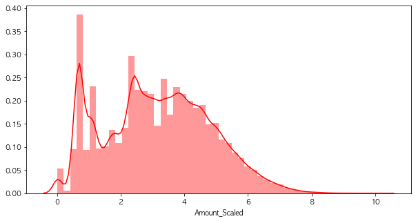
- log를 취해주니, 분포의 변화가 생겼음
4.8 성능 평가
1
2
3
4
5
6
7
8
9
10
11
12
import time

models = [lr_clf, dt_clf, rf_clf, lgbm_clf]

model_names = ['LinearReg', 'DecisionTree', 'RandomForest', 'LightGBM']

start_time = time.time()

results = get_result_pd(models, model_names, X_train, y_train, X_test, y_test)

print('Fit time : ', time.time() - start_time)
results
1
Fit time :  23.800795793533325
| accuracy | precision | recall | f1 | roc_acu | |
|---|---|---|---|---|---|
| LinearReg | 0.999169 | 0.888889 | 0.594595 | 0.712551 | 0.797233 |
| DecisionTree | 0.999345 | 0.883333 | 0.716216 | 0.791045 | 0.858026 |
| RandomForest | 0.999497 | 0.956522 | 0.743243 | 0.836502 | 0.871592 |
| LightGBM | 0.999520 | 0.949580 | 0.763514 | 0.846442 | 0.881722 |
4.9 ROC 커브 결과
1
draw_roc_curve(models, model_names, X_test, y_test)

- 이것도 큰 변화는 없음
5. Boxplot
5.1 Boxplot
- 갑자기 중간에 Boxplot을 넣은 이유는 데이터의 Outlier를 이야기하기 위해서
- 위의 데이터에서 Scale을 진행하고도 큰 변화가 없기에 outlier를 제거를 해보려고함
- Boxplot이 Outlier를 보기 쉽다
- 물론 Outlier라고 판단하는건 그외의 다른 도메인 지식의 영향이 있을수 있음
5.2 Boxplot의 구성
- 최소값 : 제 1사분위에서 1.5 IQR1을 뺀 위치이다.
- 제 1사분위(Q1) : 25%의 위치를 의미한다.
- 제 2사분위(Q2) : 50%의 위치로 중앙값(median)을 의미한다.
- 제 3사분위(Q3) : 75%의 위치를 의미한다.
- 최대값 : 제 3사분위에서 1.5 IQR을 더한 위치이다.
- 최소값과 최대값을 넘어가는 위치에 있는 값을 이상치(Outlier)라고 부른다.
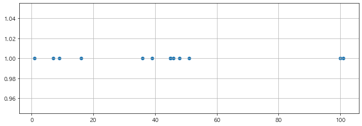
5.3 간단한 데이터로 실습
1
2
3
samples = [1, 7, 9, 16, 36, 39, 45, 45, 46, 48, 51, 100, 101]
tmp_y = [1] * len(samples)
tmp_y
1
[1, 1, 1, 1, 1, 1, 1, 1, 1, 1, 1, 1, 1]
1
2
3
4
plt.figure(figsize=(12,4))
plt.scatter(samples, tmp_y)
plt.grid()
plt.show()
5.4 해당 위치의 지표 찾기
1
2
3
4
5
6
7
print(f'1사 분위 : {np.percentile(samples, 25)}')
print(f'2사 분위 : {np.median(samples)}')
print(f'3사 분위 : {np.percentile(samples, 75)}')
print(f'IQR : {np.percentile(samples, 75) - np.percentile(samples, 25)}')
print(f'1.5 IQR : {1.5 * (np.percentile(samples, 75) - np.percentile(samples, 25))}')
print(f'최소값 : {np.percentile(samples, 25) - (1.5 * (np.percentile(samples, 75) - np.percentile(samples, 25)))}')
print(f'최대값 : {np.percentile(samples, 75) + (1.5 * (np.percentile(samples, 75) - np.percentile(samples, 25)))}')
1
2
3
4
5
6
7
1사 분위 : 16.0
2사 분위 : 45.0
3사 분위 : 48.0
IQR : 32.0
1.5 IQR : 48.0
최소값 : -32.0
최대값 : 96.0
- 1사분위 : np.percentile(samples, 25)
- 2사분위 : np.median(samples)
- 3사분위 : np.percentile(samples, 75)
- iqr : np.percentile(samples, 75) - np.percentile(samples, 25)
- 1.5 iqr = (np.percentile(samples, 75) - np.percentile(samples, 25)) * 1.5
- 최소값 = np.percentile(samples, 25) - ((np.percentile(samples, 75) - np.percentile(samples, 25)) * 1.5)
- 최대값 = np.percentile(samples, 75) + ((np.percentile(samples, 75) - np.percentile(samples, 25)) * 1.5)
5.5 실제로 그려보기
1
2
3
4
5
6
7
8
9
10
11
12
13
14
q1 = np.percentile(samples, 25)
q2 = np.median(samples)
q3 = np.percentile(samples, 75)
upper_fence = q3 + iqr * 1.5
lower_fence = q1 - iqr * 1.5
plt.figure(figsize=(12,4))
plt.scatter(samples, tmp_y)
plt.axvline(x=q1, color = 'black')
plt.axvline(x=q2, color = 'red')
plt.axvline(x=q3, color = 'black')
plt.axvline(x=upper_fence, color = 'black', ls = 'dashed')
plt.axvline(x=lower_fence, color = 'black', ls = 'dashed')
plt.grid()
plt.show()
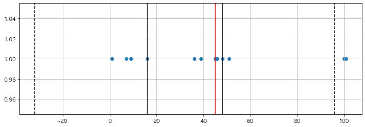
- 위의 내용을 모두 적용하여 그려봄
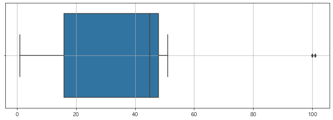
5.6 Boxplot은 seabonr에 있음
1
2
3
4
5
import seaborn as sns
plt.figure(figsize=(12,4))
sns.boxplot(samples)
plt.grid()
plt.show()
6. Boxplot을 이용하여 Outlier를 정리해보기
6.1 Boxplot으로 그리기
1
2
3
4
5
import seaborn as sns

plt.figure(figsize=(10, 7))
sns.boxplot(data=raw_data[['V13','V14','V15']])
plt.show()
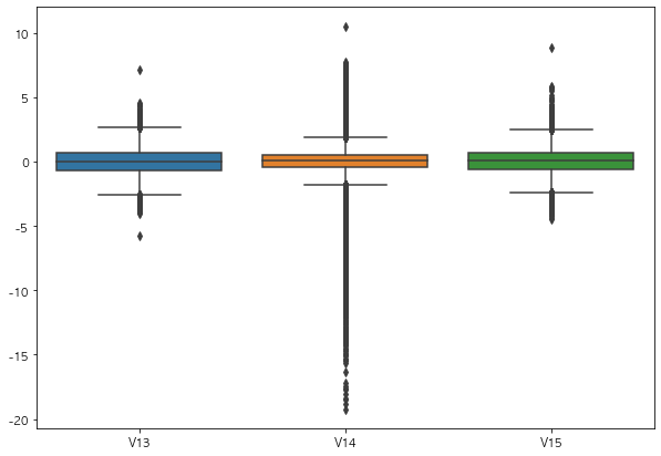
- 딱히 해당 데이터에 대해 도메인지식은 없지만, V14 컬럼은 Outlier라고 할만큼 이상한 데이터가 많음
6.2 Outlier의 인덱스를 파악하는 함수 작성
1
2
3
4
5
6
7
8
9
10
11
12
13
def get_outlier(df = None, column = None, weight = 1.5):
    fraud = df[df['Class']==1][column]
    quantile_25 = np.percentile(fraud.values, 25)
    quantile_75 = np.percentile(fraud.values, 75)

    iqr = quantile_75 - quantile_25
    iqr_weight = iqr * weight
    lowest_val = quantile_25 - iqr_weight
    highest_val = quantile_75 + iqr_weight

    outlier_index = fraud[(fraud < lowest_val) | (fraud > highest_val)].index

    return outlier_index
6.3 Outlier 찾기
1
get_outlier(df = raw_data, column='V14', weight=1.5)
1
Int64Index([8296, 8615, 9035, 9252], dtype='int64')
6.4 Outlier 제거
1
raw_data_copy.shape
1
(284807, 29)
1
2
3
outlier_index = get_outlier(df = raw_data, column= 'V14', weight= 1.5)
raw_data_copy.drop(outlier_index, axis =0, inplace=True)
raw_data_copy.shape
1
(284803, 29)
- V14의 컬럼에 아웃라이어를 인덱스로 찾아서 삭제함
6.5 Outlier제거 한 뒤 데이터 다시 나누기
1
2
3
4
5
6
X = raw_data_copy

raw_data.drop(outlier_index, axis =0, inplace =True)
y = raw_data.iloc[:,-1]

X_train, X_test, y_train, y_test = train_test_split(X,y, test_size = 0.3, random_state = 13, stratify = y)
- 삭제한 아웃라이어를 기준으로 데이터를 나누었음
6.6 Outlier 제거 후 성능 평가
1
2
3
4
5
6
7
8
9
10
11
12
import time

models = [lr_clf, dt_clf, rf_clf, lgbm_clf]

model_names = ['LinearReg', 'DecisionTree', 'RandomForest', 'LightGBM']

start_time = time.time()

results = get_result_pd(models, model_names, X_train, y_train, X_test, y_test)

print('Fit time : ', time.time() - start_time)
results
1
Fit time :  25.215320110321045
| accuracy | precision | recall | f1 | roc_acu | |
|---|---|---|---|---|---|
| LinearReg | 0.999286 | 0.904762 | 0.650685 | 0.756972 | 0.825284 |
| DecisionTree | 0.999427 | 0.870229 | 0.780822 | 0.823105 | 0.890311 |
| RandomForest | 0.999497 | 0.918699 | 0.773973 | 0.840149 | 0.886928 |
| LightGBM | 0.999602 | 0.951613 | 0.808219 | 0.874074 | 0.904074 |
- ROC 커브로 봐봐야 겠음
6.7 ROC커브
1
draw_roc_curve(models, model_names, X_test, y_test)
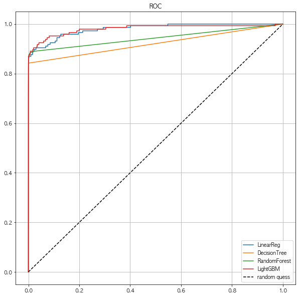
- Outlier를 제거했는데도 별 차이는 없어보임
7. SMOTE Oversampling
7.1 SMOTE Oversampling
- 사실 위의 데이터는 조금 문제가 있는게, 전체 데이터에서 y의 1값이 0.17%라는것이다
- 그 뜻은 그냥 모든 y값을 0으로 예측해도 틀린값은 0.17% 밖에 안된다는 이야기
- 그래서 위의 모든 데이터가 Acc가 높게 나온것
- 해당 문제를 잡기 위해 Oversampling이 필요함
7.2 Undersampling vs Oversampling
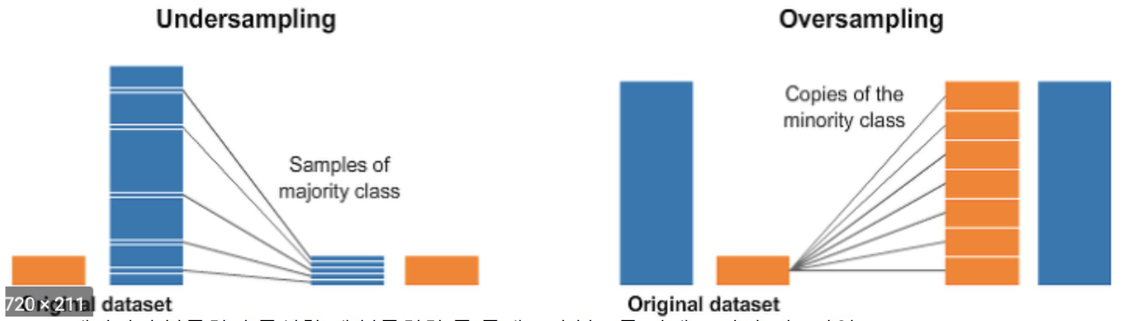
- 데이터의 불균형이 극심할때 불균형한 두 클래스의 분포를 강제로 맞추는 작업
- 언더샘플링 : 많은 수의 데이터를 적은 수의 데이터로 강제 조정
- 오버샘플링 :
- 원본 데이터의 피쳐값들을 약간 변경하여 증식
- 대표적으로 SMOTE방법이 있음
- 적은 데이터 세트에 있는 개별 데이터를 k-최근접 이웃 방법으로 찾아서 데이터의 분포 사이에 새로운 데이터를 만드는 방식
- imbalanced-learn 이라는 Python pkg가 있음
7.3 설치
- pip install imbalanced-learn
7.4 SMOTE 적용하기
1
2
3
4
from imblearn.over_sampling import SMOTE

smote = SMOTE(random_state=13)
X_train_over, y_train_over = smote.fit_sample(X_train, y_train)
- 단, 데이터 증강은 train 데이터에서만 한다
7.5 데이터 증강의 효과
1
2
print(f'증강 전 : X_train : {X_train.shape}, y_train : {y_train.shape}')
print(f'증강 후 : X_train : {X_train_over.shape}, y_train : {y_train_over.shape}')
1
2
증강 전 : X_train : (199362, 29), y_train : (199362,)
증강 후 : X_train : (398040, 29), y_train : (398040,)
1
2
print(np.unique(y_train, return_counts= True))
print(np.unique(y_train_over, return_counts= True))
1
2
(array([0, 1]), array([199020,    342]))
(array([0, 1]), array([199020, 199020]))
- 증강 전의 전체 데이터는 199362였고, 증강 후에 398040으로 늘어남
- 증강 전의 y_train의 1값은 342개 으나, 증강 후의 1값은 199020개로 대폭 늘어나게 됨
7.6 Oversampling 후의 성능확인
1
2
3
4
5
6
7
8
9
10
11
12
import time

models = [lr_clf, dt_clf, rf_clf, lgbm_clf]

model_names = ['LinearReg', 'DecisionTree', 'RandomForest', 'LightGBM']

start_time = time.time()

results = get_result_pd(models, model_names, X_train_over, y_train_over, X_test, y_test)

print('Fit time : ', time.time() - start_time)
results
1
Fit time :  50.29139733314514
| accuracy | precision | recall | f1 | roc_acu | |
|---|---|---|---|---|---|
| LinearReg | 0.975609 | 0.059545 | 0.897260 | 0.111679 | 0.936502 |
| DecisionTree | 0.968984 | 0.046048 | 0.869863 | 0.087466 | 0.919509 |
| RandomForest | 0.999532 | 0.873239 | 0.849315 | 0.861111 | 0.924552 |
| LightGBM | 0.999532 | 0.873239 | 0.849315 | 0.861111 | 0.924552 |
- 그전과 비교하여 recall이 좋아진것을 확인할수 있음
7.7 ROC 커브
1
draw_roc_curve(models, model_names, X_test, y_test)
### 7.8 결론 - 데이터의 불균형이 있을땐 Oversampling도 하나의 방안이 될수있음 - Outlier는 수치적으로 이상한 애들이긴 하지만, 도메인지식으로 인해 제거를 안할수도 있음