1.K-Means
1.1 K-Means
- 군집화에서 가장 일반적인 알고리즘
- 군집 중심이라는 임의의 지점을 선핵해서 해당 중심에 가장 가까운 포인트들을 선택하는 군집화
- 일반적인 군집화에서 가장 많이 사용되는 기법
- 거리 기반 알고리즘으로 속성의 개수(K)가 매우 많을 경우 군집화의 정확도가 떨어짐
1.2 원리
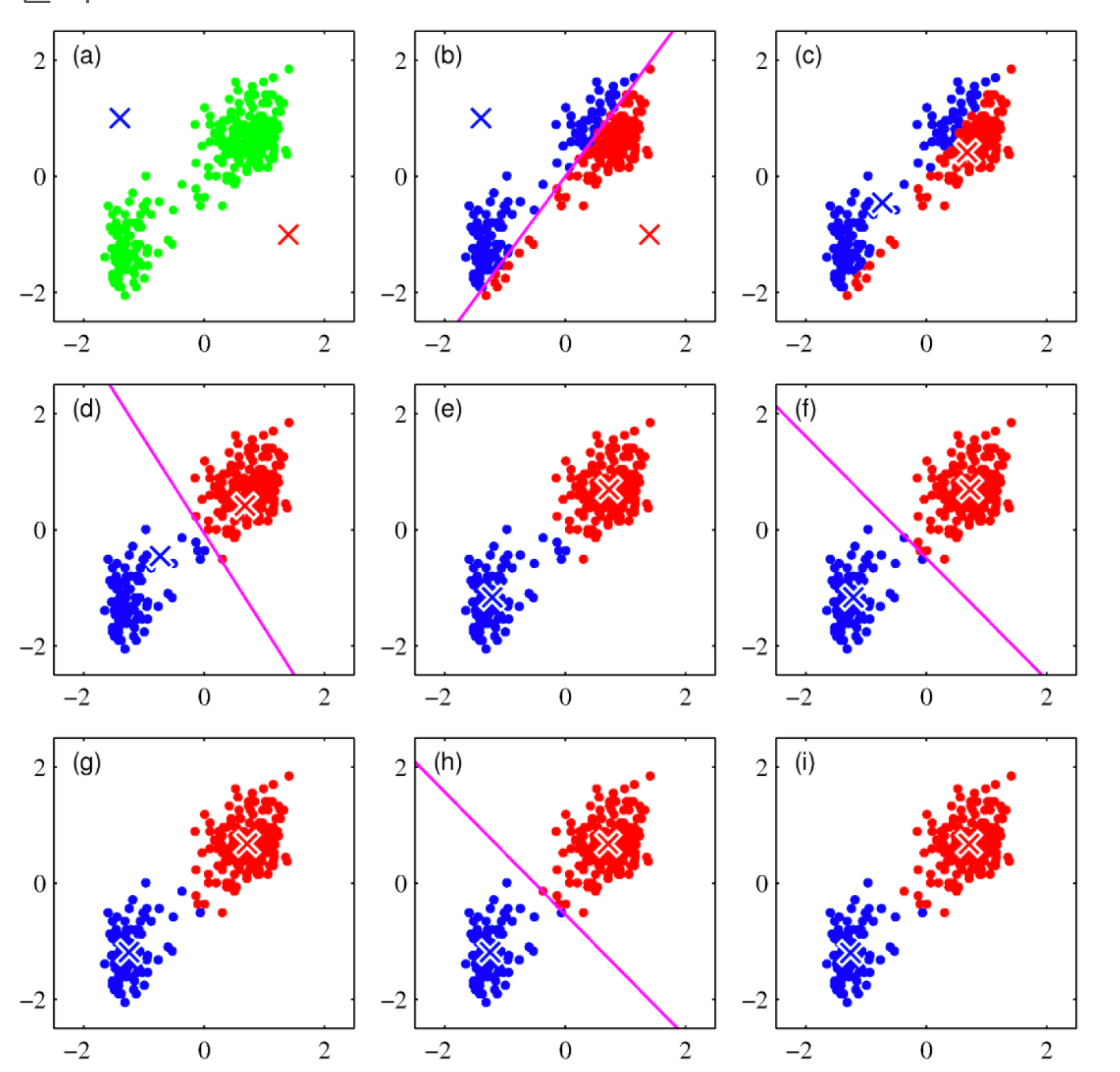
- 초기 중심점을 설정
- 각 데이터는 가장 가까운 중심점에 소속
- 중심점에 할당된 평균값으로 중심점 이동
- 각 데이터는 이동된 중심점 기준으로 가장 가까운 중심점에 소속
- 다시 중심점에 할당된 데이터들의 평균값으로 중심점 이동
- 데이터들의 중심점 소속 변경이 없으면 종료됨
2. Iris 데이터로 실습
2.1 Data Load
1
2
3
4
5
6
7
8
9
from sklearn.preprocessing import scale
from sklearn.datasets import load_iris
from sklearn.cluster import KMeans
import matplotlib.pyplot as plt
import numpy as np
import pandas as pd
%matplotlib inline

iris = load_iris()
- 사이킷런에 있는 Iris 데이터를 불러옴
1
iris.feature_names
1
2
3
4
['sepal length (cm)',
 'sepal width (cm)',
 'petal length (cm)',
 'petal width (cm)']
1
2
cols = [each[:-5] for each in iris.feature_names]
cols
1
['sepal length', 'sepal width', 'petal length', 'petal width']
- 특성 이름의 (cm)이 전처리하기 힘드니 삭제함
2.2 Data Preprocessing
1
2
iris_df = pd.DataFrame(iris.data, columns=cols)
iris_df.head()
| sepal length | sepal width | petal length | petal width | |
|---|---|---|---|---|
| 0 | 5.1 | 3.5 | 1.4 | 0.2 |
| 1 | 4.9 | 3.0 | 1.4 | 0.2 |
| 2 | 4.7 | 3.2 | 1.3 | 0.2 |
| 3 | 4.6 | 3.1 | 1.5 | 0.2 |
| 4 | 5.0 | 3.6 | 1.4 | 0.2 |
1
2
feature = iris_df[['petal length','petal width']]
feature.head()
| petal length | petal width | |
|---|---|---|
| 0 | 1.4 | 0.2 |
| 1 | 1.4 | 0.2 |
| 2 | 1.3 | 0.2 |
| 3 | 1.5 | 0.2 |
| 4 | 1.4 | 0.2 |
- 편의상 꽃잎의 넓이와 길이, 2개의 특성만 사용
2.3 군집화
1
2
model = KMeans(n_clusters= 3)
model.fit(feature)
1
KMeans(n_clusters=3)
- n_clusters : 군집화할 개수, 즉 군집 중심점의 갯수
- init : 초기 군집 중심점의 좌표를 설정하는 방식을 결정
- max_iter : 최대 반복 횟수, 모든 데이터의 중심점 이동이 없으면 종료
2.4 결과
1
model.labels_
1
2
3
4
5
6
7
array([1, 1, 1, 1, 1, 1, 1, 1, 1, 1, 1, 1, 1, 1, 1, 1, 1, 1, 1, 1, 1, 1,
       1, 1, 1, 1, 1, 1, 1, 1, 1, 1, 1, 1, 1, 1, 1, 1, 1, 1, 1, 1, 1, 1,
       1, 1, 1, 1, 1, 1, 2, 2, 2, 2, 2, 2, 2, 2, 2, 2, 2, 2, 2, 2, 2, 2,
       2, 2, 2, 2, 2, 2, 2, 2, 2, 2, 2, 0, 2, 2, 2, 2, 2, 0, 2, 2, 2, 2,
       2, 2, 2, 2, 2, 2, 2, 2, 2, 2, 2, 2, 0, 0, 0, 0, 0, 0, 2, 0, 0, 0,
       0, 0, 0, 0, 0, 0, 0, 0, 0, 2, 0, 0, 0, 0, 0, 0, 2, 0, 0, 0, 0, 0,
       0, 0, 0, 0, 0, 0, 2, 0, 0, 0, 0, 0, 0, 0, 0, 0, 0, 0], dtype=int32)
- 군집화이기 때문에 지도학습의 라벨과는 다름
2.5 군집 중심값
1
model.cluster_centers_
1
2
3
array([[5.59583333, 2.0375    ],
       [1.462     , 0.246     ],
       [4.26923077, 1.34230769]])
- 라벨의 0부터 2까지의 중심값을 표현함
- 시각화 할때 유용함
2.6 시각화를 위해 정리
1
2
3
predict = pd.DataFrame(model.predict(feature), columns=['cluster'])
feature = pd.concat([feature, predict], axis = 1)
feature.head()
| petal length | petal width | cluster | |
|---|---|---|---|
| 0 | 1.4 | 0.2 | 1 |
| 1 | 1.4 | 0.2 | 1 |
| 2 | 1.3 | 0.2 | 1 |
| 3 | 1.5 | 0.2 | 1 |
| 4 | 1.4 | 0.2 | 1 |
- 예측값을 데이터프레임으로 만들고 이전에 있던 feature 데이터프레임에 붙임
2.7 시각화
1
2
3
4
5
6
7
8
9
10
centers = pd.DataFrame(model.cluster_centers_, columns=[
                       'petal length', 'petal width'])
center_x = centers['petal length']
center_y = centers['petal width']

plt.figure(figsize=(12, 8))
plt.scatter(feature['petal length'], feature['petal width'],
            c=feature['cluster'], alpha=0.5)
plt.scatter(center_x, center_y, s=50, marker='D', c='r')
plt.show()
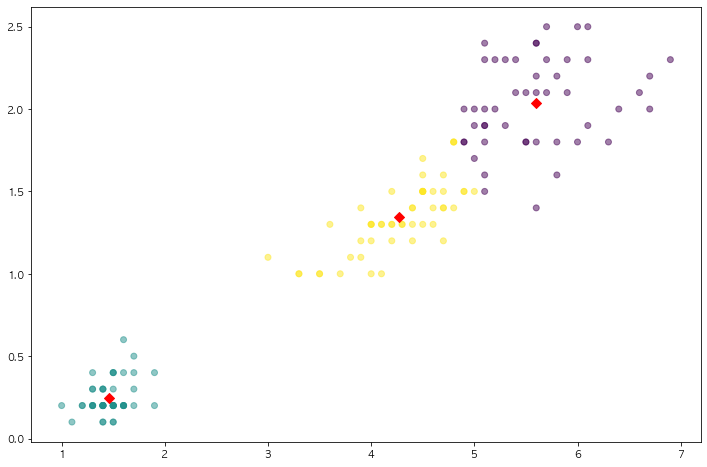
- 2개의 특성을 3개로 군집화 시켰으며, 빨간점이 각 군집의 중심임
- 2개짜리 특성을 3개로 나눌수도 있음!
2. Make Blobs
2.1 Make Blobs
1
2
3
4
5
6
7
from sklearn.datasets import make_blobs

X, y = make_blobs(n_samples= 200, n_features=2, centers=3, cluster_std= 0.8, random_state= 0)
print(X.shape, y.shape)

unique, counts = np.unique(y, return_counts= True)
print(unique, counts)
1
2
(200, 2) (200,)
[0 1 2] [67 67 66]
- Make Blobs : 군집화 연습을 위한 데이터 생성기
- n_samples : 생성되는 샘플의 수
- n_features : 샘플이 가지는 특성의 수
- centers : 군집화되는 라벨
- cluter_std : 군집의 표준편차
2.2 데이터 정리
1
2
3
cluster_df = pd.DataFrame(data = X, columns=['ftr1', 'ftr2'])
cluster_df['target'] = y
cluster_df.head()
| ftr1 | ftr2 | target | |
|---|---|---|---|
| 0 | -1.692427 | 3.622025 | 2 |
| 1 | 0.697940 | 4.428867 | 0 |
| 2 | 1.100228 | 4.606317 | 0 |
| 3 | -1.448724 | 3.384245 | 2 |
| 4 | 1.214861 | 5.364896 | 0 |
- Make Blobs로 만든 데이터를 데이터 프레임화 시킴
2.3 군집화
1
2
3
4
kmeans = KMeans(n_clusters=3, init='k-means++', max_iter = 200, random_state=13)
cluster_labels = kmeans.fit_predict(X)
cluster_df['kmeans_label'] = cluster_labels
cluster_df.head()
| ftr1 | ftr2 | target | kmeans_label | |
|---|---|---|---|---|
| 0 | -1.692427 | 3.622025 | 2 | 2 |
| 1 | 0.697940 | 4.428867 | 0 | 1 |
| 2 | 1.100228 | 4.606317 | 0 | 1 |
| 3 | -1.448724 | 3.384245 | 2 | 2 |
| 4 | 1.214861 | 5.364896 | 0 | 1 |
- Kmeans를 사용하여 예측함.
- 실제 target과 예측한 label을 비교하는 데이터프레임을 생성
2.4 시각화
1
2
3
4
5
6
7
8
9
10
11
centers = kmeans.cluster_centers_
unique_labels = np.unique(cluster_labels)
markers = ['o', 's', '^', 'P', 'D', 'H', 'x']

for label in unique_labels:
    label_cluster = cluster_df[cluster_df['kmeans_label'] == label]
    center_x_y = centers[label]
    plt.scatter(x = label_cluster['ftr1'], y=label_cluster['ftr2'], edgecolors='k', marker=markers[label])
    plt.scatter(x = center_x_y[0], y = center_x_y[1], s=200, color = 'white', alpha = 0.9, edgecolors = 'k', marker=markers[label])
    plt.scatter(x = center_x_y[0], y = center_x_y[1], s=70, color = 'white', alpha = 0.9, edgecolors = 'k', marker='$%d$' % label)
plt.show()
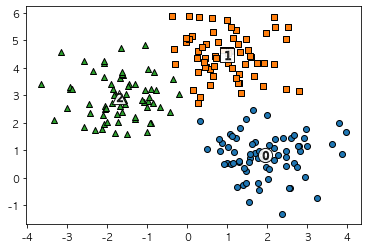
- 예측한 군집의 모형
2.5 결과 확인
1
cluster_df.groupby('target')['kmeans_label'].value_counts()
1
2
3
4
5
6
7
target  kmeans_label
0       1               66
        2                1
1       0               67
2       2               65
        0                1
Name: kmeans_label, dtype: int64
- target 0을 kmeans_label 1로 66개, 2로 1개 즉, target0을 kmeans_label 1로 군집,
- target 1을 kmeans_label 0으로 모두 군집화
- target 2을 kmeans_label 2로 65개, 1개는 0으로 군집화
- target의 0,1,2를 맞추는것이 아닌, 0,1,2를 제대로 군집화시키는지를 봐야함
3. 군집 평가
3.1 군집 결과의 평가
- 분류기는 평가 기준을 가지고 있지만, 군집은 그렇지 않을떄가 많음
- 군집 결과를 평가하기 위해 실루엣 분석을 많이 활용함
3.2 실루엣 분석
- 각 군집 간의 거리가 얼마나 효율적으로 분리돼어 있는지를 나타냄
- 다른 군집과의 거리는 떨어져 있고, 동일 군집끼리의 데이터는 서로 가깝게 잘 뭉쳐 있는지 확인
- 군집화가 잘 되어 있을 수록 개별 군집은 비슷한 정도의 여유 공간을 가지고 있음
- 실루엣 계수 : 개별 데이터가 가지는 군집화 지표
3.3 n = 2인 경우
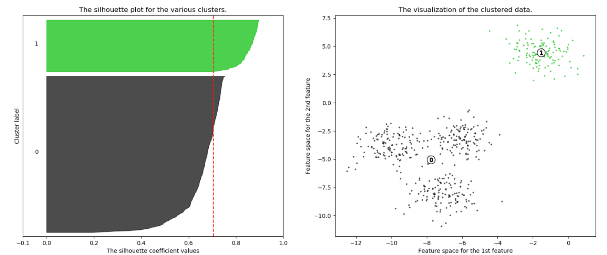
- 1번 군집의 경우 0번 군집과 잘 떨어져 있고, 잘 뭉쳐 있음
- 0번 군집의 경우 내부 데이터끼리 많이 떨어져있는 것을 알수 있음
3.4 n = 3인 경우
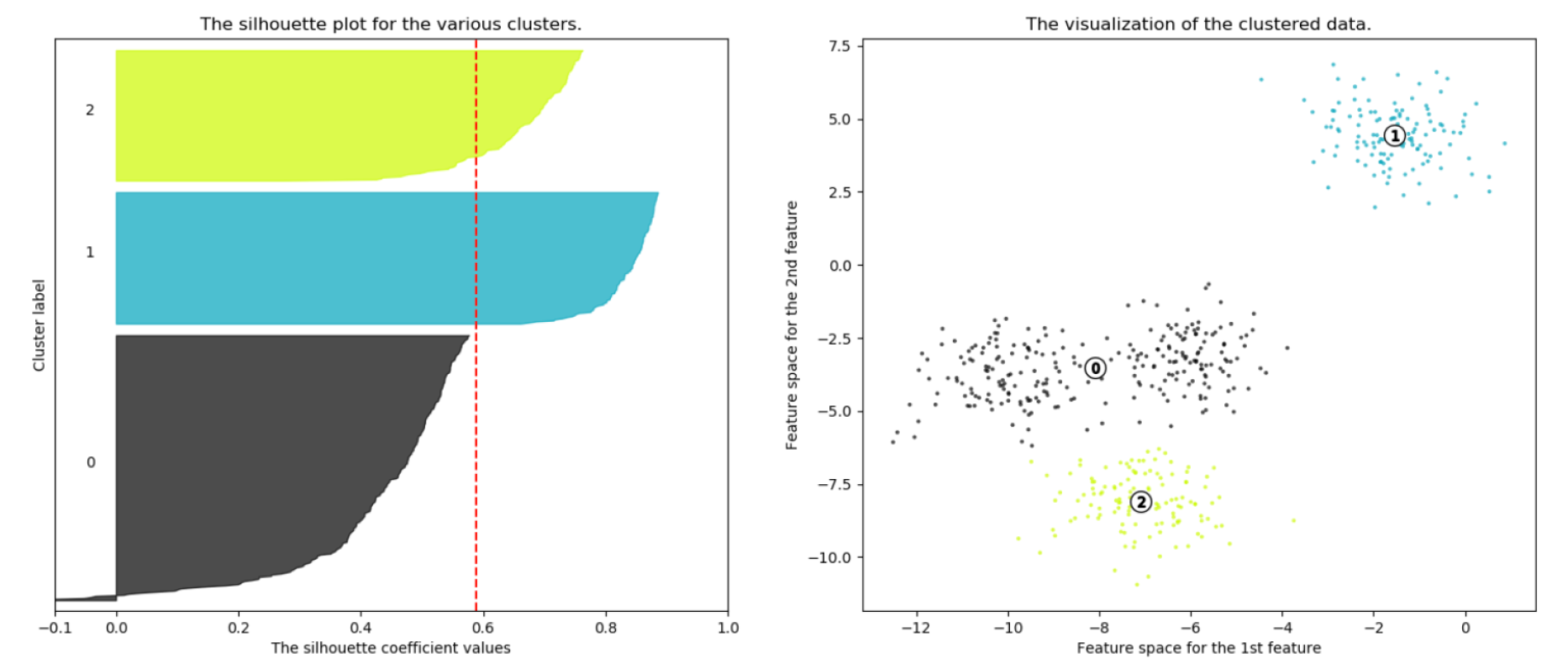
- 0번 군집의 경우 2번 군집과 가깝게 위치해 있다
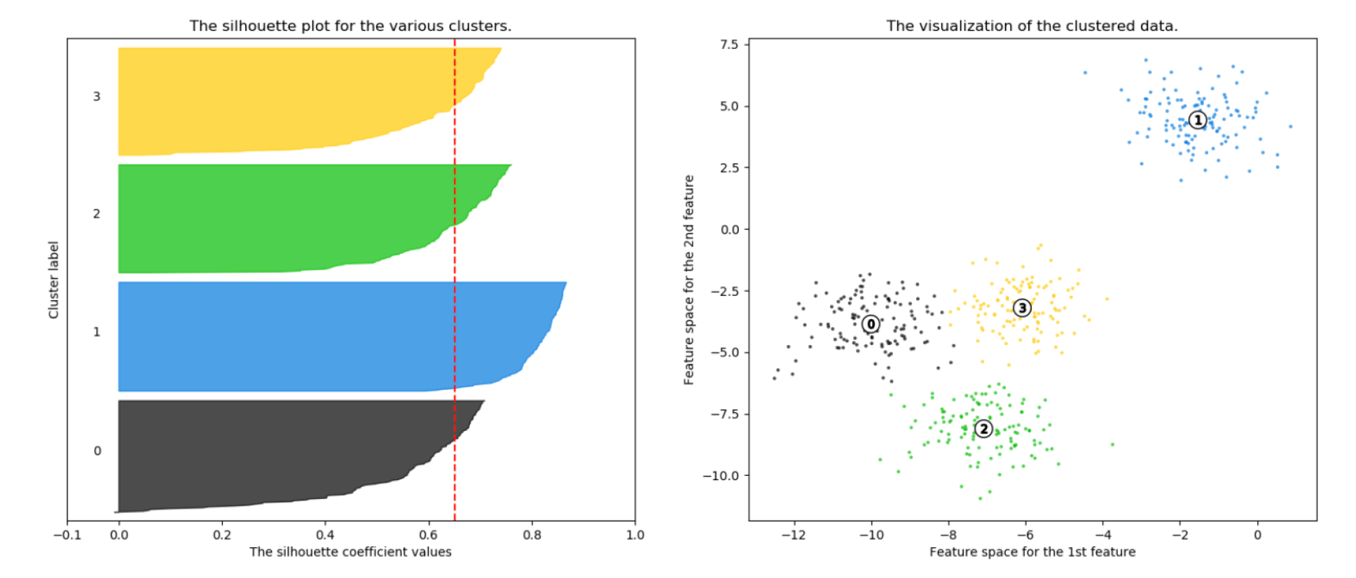
군집이 4개로 잘 나뉘어져 있는것을 알수 있다
실루엣 분석의 그래프가 균일한 칼 모양을 가지고 있으면 군집화가 잘 된것
3.5 Iris 데이터로 실습
1
2
3
4
5
6
7
8
from sklearn.datasets import load_iris
from sklearn.cluster import KMeans
import pandas as pd

iris = load_iris()
feature_names = ['sepal_length', 'sepal_width', 'petal_length', 'petal_width']
iris_df = pd.DataFrame(iris.data, columns= feature_names)
kmeans = KMeans(n_clusters=3, init = 'k-means++', max_iter = 300, random_state = 0).fit(iris_df)
- iris 데이터를 불러오고 4개의 특성을 모두 사용하여 3개의 군집으로 군집화를 해봄
3.6 군집 결과 정리
1
2
iris_df['cluster'] = kmeans.labels_
iris_df.head()
| sepal_length | sepal_width | petal_length | petal_width | cluster | |
|---|---|---|---|---|---|
| 0 | 5.1 | 3.5 | 1.4 | 0.2 | 1 |
| 1 | 4.9 | 3.0 | 1.4 | 0.2 | 1 |
| 2 | 4.7 | 3.2 | 1.3 | 0.2 | 1 |
| 3 | 4.6 | 3.1 | 1.5 | 0.2 | 1 |
| 4 | 5.0 | 3.6 | 1.4 | 0.2 | 1 |
3.7 군집 결과 평가
1
2
3
4
5
6
7
from sklearn.metrics import silhouette_samples, silhouette_score

avg_value = silhouette_score(iris.data, iris_df['cluster'])
score_values = silhouette_samples(iris.data, iris_df['cluster'])

print(f'avg_vale : {avg_value}')
print(f'silhouette_samples() return값의 shape : {score_values.shape}')
1
2
avg_vale : 0.5528190123564091
silhouette_samples() return값의 shape : (150,)
- silhouette score는 집단이 멀리 떨어질수록 1로 나옴
3.8 실루엣 시각화
1
2
3
4
5
6
7
8
9
10
11
12
13
14
15
16
17
18
19
20
21
22
23
24
25
26
27
28
29
30
31
32
33
34
35
36
def visualize_silhouette(cluster_lists, X_features):
    from sklearn.datasets import make_blobs
    from sklearn.cluster import KMeans
    from sklearn.metrics import silhouette_samples, silhouette_score
    import matplotlib.pyplot as plt
    import matplotlib.cm as cm
    import numpy as np
    import math
    n_cols = len(cluster_lists)
    fig, axs = plt.subplots(figsize=(4*n_cols, 4), nrows=1, ncols=n_cols)
    for ind, n_cluster in enumerate(cluster_lists):
        clusterer = KMeans(n_clusters = n_cluster, max_iter=500, random_state=0)
        cluster_labels = clusterer.fit_predict(X_features)
        sil_avg = silhouette_score(X_features, cluster_labels)
        sil_values = silhouette_samples(X_features, cluster_labels)
        y_lower = 10
        axs[ind].set_title('Number of Cluster : '+ str(n_cluster)+'\n' \
                          'Silhouette Score :' + str(round(sil_avg,3)) )
        axs[ind].set_xlabel("The silhouette coefficient values")
        axs[ind].set_ylabel("Cluster label")
        axs[ind].set_xlim([-0.1, 1])
        axs[ind].set_ylim([0, len(X_features) + (n_cluster + 1) * 10])
        axs[ind].set_yticks([])  # Clear the yaxis labels / ticks
        axs[ind].set_xticks([0, 0.2, 0.4, 0.6, 0.8, 1])
        for i in range(n_cluster):
            ith_cluster_sil_values = sil_values[cluster_labels==i]
            ith_cluster_sil_values.sort()
            size_cluster_i = ith_cluster_sil_values.shape[0]
            y_upper = y_lower + size_cluster_i
            color = cm.nipy_spectral(float(i) / n_cluster)
            axs[ind].fill_betweenx(np.arange(y_lower, y_upper), 0,
                                   ith_cluster_sil_values, facecolor=color,
                                   edgecolor=color, alpha=0.7)
            axs[ind].text(-0.05, y_lower + 0.5 * size_cluster_i, str(i))
            y_lower = y_upper + 10
        axs[ind].axvline(x=sil_avg, color="red", linestyle="--")
1
visualize_silhouette([2,3,4], iris.data)
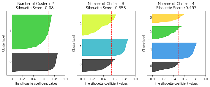
- n_cluster의 갯수가 늘어날수록 실루엣 그래프가 칼 모양을 하고 있다.